'Memorable' 1968 Olympic logo used lines as power
As we commemorate the 50th anniversary of the seminal moment of the Mexico City Games, when Americans John Carlos and Tommie Smith raised a black-gloved fist from the medals podium, GlobalSport Matters looks back at the year from a global sporting perspective. From the World Series helping a wounded Detroit heal to athletic innovations that trace their origins to those Olympics, 1968 served as a critical pivot point in the role sports plays in society and introduced the modern era of athlete activism.
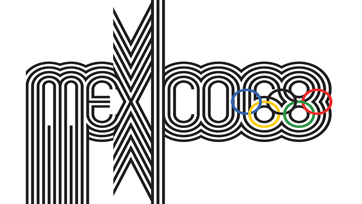
The logo for each Olympic Games is supposed to signify not only the games, but also the host city. For the 1968 Olympics, Lance Wyman was tasked with envisioning what would represent Mexico City.
“It was making geometry sing,” Wyman recalled. “It was making it expressive, making it beautiful, making it strong. It had a cultural characteristic when we put it all together.”
As a 29-year-old graphic designer from New York City, Wyman and his colleague Peter Murdoch traveled to Mexico in 1966 to take part in the competition to design a logo that would represent the games and Mexico. Wyman studied industrial design and had been working for industrial designer George Nelson — one of the founders of American Modernism — in New York. After Wyman created graphics for the 1964 New York World’s Fair, one of the Mexican artists approached Wyman and raised the idea of his working on the 1968 logo.“We had two weeks to come up with something,” Wyman chuckled. “We went through about two weeks without getting anything.”But, Wyman had come up with the idea to brand the city in a logo that personified what made sports: speed, movement and emotion. Wyman and company hand drew hundreds of designs with different angles and patterns before coming up with his final idea: an optical style that matched time and place.
 “Two days, on that one idea, it took two days,” Wyman said. “The solution is an obvious combination, we had the place, the year, and the Olympic rings. Because the geometry worked so well, we were able to do it and create an image that was memorable.”
Nobody had seen anything like the Mexico 68 design with its incorporation of optical art and use of geometry. Wyman recalled there were those who didn’t get it at first.
“I remember one of the guys who did the Olympic graphics four years later for the Munich Games; he came in and looked at what we were doing and he said ‘We’re further ahead than you’ and walked out,” Wyman chuckled. “A Swiss reporter came in and he looked at [the design] and said, ‘That’s not very legible.’”
Wyman wasn’t concerned. “It wasn’t meant to be legible,” Wyman said, “But, it was meant to be branding.”
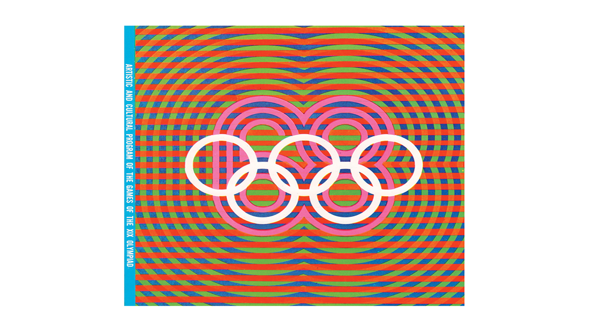
Wyman’s team stuck with it, and so did the Mexican Olympic Committee. Soon enough, the Mexico 68 logo was everywhere for the world to see. In addition to the official logo, the Olympic Committee tasked Wyman’s team tasked with creating the individual event icons used for each sport.
“One of the big influences to make the imagery look like it was from Mexico and by Mexico was the use of color,” Wyman said. “We tried to use color as powerful as we could.”
Wyman described how one of the colors that really stood out was the magenta. “No matter how many flag colors you use, it will look like the Olympics, but as soon as you introduce magenta, it started looking like the Olympics in Mexico,” Wyman said.
He also was influenced by Mexican artwork and geometric structure, mixing it with an optical art style. “The idea of the optical art: Sports are speed, strength, balance. All of those things that are animated by sports themselves, I thought we could do that with the graphics.” Wyman said.
![]() By representing the biggest stage on Earth, the logo also represented more than just the Olympics. The student riots in Mexico City in the days prior to the opening ceremony used the Mexico 68 design on banners calling for change in the Mexican government. The protests ended in gunfire, an event now known as the Tlatelolco massacre.
By representing the biggest stage on Earth, the logo also represented more than just the Olympics. The student riots in Mexico City in the days prior to the opening ceremony used the Mexico 68 design on banners calling for change in the Mexican government. The protests ended in gunfire, an event now known as the Tlatelolco massacre.
In a 2014 speech at the Walker Arts Center in Minneapolis, Wyman described being in Mexico City during the massacre. “I felt torn between wanting the games to not be cancelled by the violence and wanting to support the students,” Wyman said. Because Wyman was working for the Olympic Committee, he said “it felt like the massacre was being swept under the rug internationally, [but,] it was impossible to avoid in Mexico City.”
Wyman described how the students used the ’68 logo as well as copying its art style and replacing it with images that suited the protests. “They even replaced our sporting event symbols with images of grenades, gas masks, bayonets, boots and bombs,” Wyman said. “My imagery was creating part of the story.”
In response to the tragedy, Wyman helped create the Tlatelolco Memorial logo represented by a white dove that was posted all over the city in memoriam to the students killed. There is also an art gallery, “Memorial del 68,” on the University of Mexico campus consisting of student artwork from the riots and protests.
No one, especially Wyman, could have predicted the 1968 Olympics would be as much a statement for human rights they became. However, the events surrounding the games will always be acknowledged with Lance Wyman’s Mexico 68 logo just as the games are.
Tyler Dare is a senior journalism major at Arizona State University